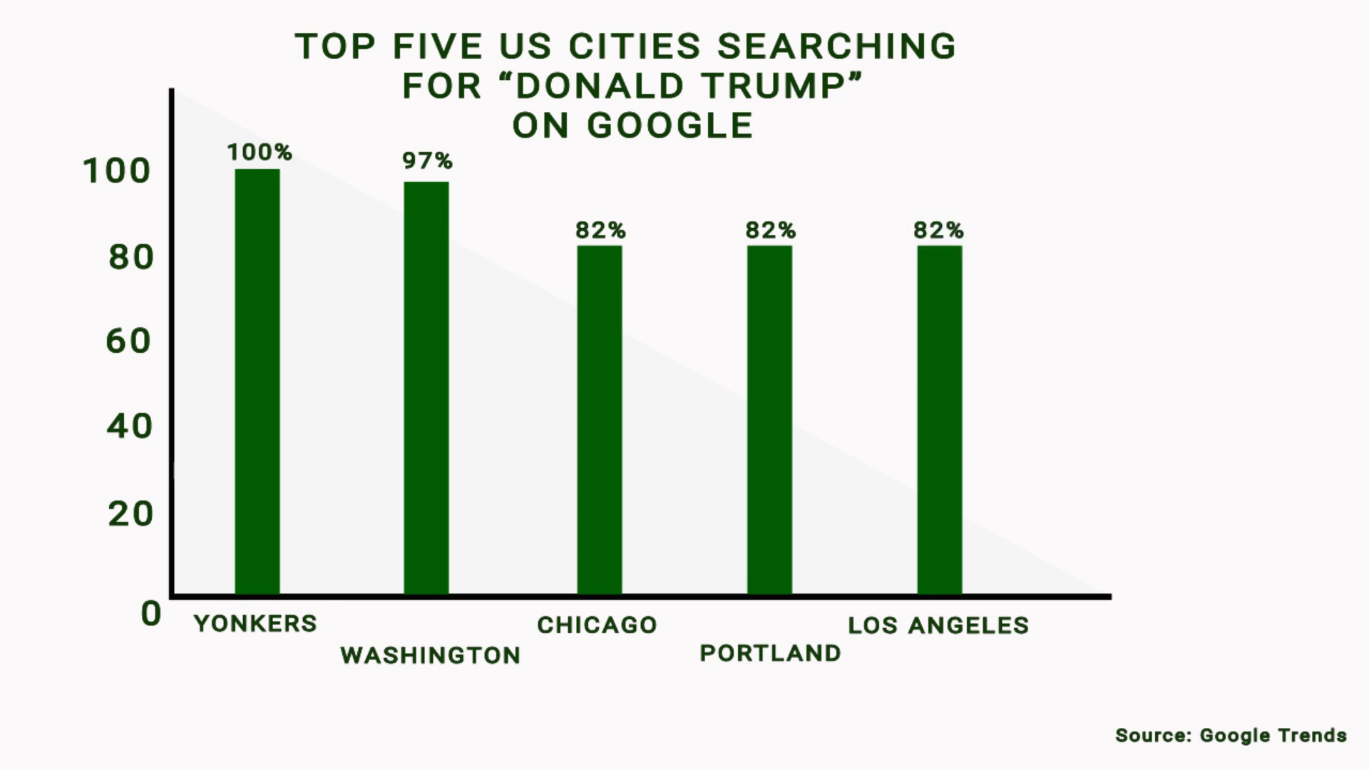
A bar graph is a great way to show comparison between your data. While a plain graph is fine, you can also try animating your bar graph to not only make it look better but also to make the viewer notice and recollect more of your presentation data.
Generally, when a slide or page with a lot of data/info is presented to viewers, they tend to skim it quickly and then their attention is diverted. So they might miss a few important details.
But, using an animated bar graph/animated infographics, you can show all your data one by one. That way, the user is automatically guided to look at each data point you are presenting.
This is because we animate each bar and each data point separately. There is also a pause between the bars. Since the user is presented with limited data each time, there is a good chance that they will notice each bar and each data point, as it animates.
You can also be sure that they will recollect more information about your presentation, this way. The above bar graph with five bars plays for just 14 seconds with a 2-second delay in the beginning and in the end.
If you want to create animated bar graph videos/infographics/presentations, head over to wowsuper.net homepage (click) and submit your requirements in the contact form. We’ll get back to you as soon as possible.

